Responsive Web Design
Go beyond the traditonal boundaries of the web and explore a whole new world of Responsive Web Designs, designed to perfectly fit any browser operated device
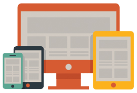
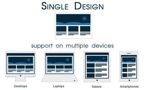
Responsive Web Design (RWD) is a device-independent UI (user interface) design philosophy that aims to develop and deliver an optimized website experience on devices with different widths and different resolutions: PC, notebook, tablet, smart phone, etc. It is a technology using which web designers code the style sheets of the website in a manner that its layout magically adjusts itself to more comfortably fit the width of the browser in which it is being viewed.
What Challenges/Problems Does Responsive Web Design Solve?
- Upgrade the mobile and tablet viewing experience of your website visitors - no vertical or horizontal scrolling.
- No separate websites to be designed and maintained for mobile users.
- Fluid grids work as an extension of liquid layouts - albeit in a more robust manner fitting elements into huge and small screens effortlessly.
- Style Separated from Content - Since responsive web design works through CSS media queries, you get the advantage of content management abilities of your CMS of choice. We provide Drupal and Wordpress based content-managed responsive sites.
Is Responsive Design Expensive?
How expensive is Responsive Web Design? Is an investment in responsive worth it for your business?
These are the questions that frustrate most of the business owners who want to get a responsive website designed for their business. The answer lies in the type of business you run and the audience who visit your website. Simply put, responsive web design is not for everyone. However, for most of the businesses who have younger audiences that browser their site from smartphones, iPads and Android devices, it makes much more sense to go for a responsive web design.
Find out your site usage patterns in Browser and OS report of your site's Google Analytics account. If a considerable size of audience is flowing through the iPhone/iPad channel, it is time for you to go responsive.
For websites that already have a mobile version, it makes sense to go responsive too as the need of managing two separate sites will no longer be there.

Responsive Web Design Future?
Definitely Yes. Technologies such as Flash have become obsolete and the web is moving towards standard-driven web development approach that utilizes HTML5 and CSS 3 for developing and designing websites. Those who embrace responsive web design tell the world that they have a vision for the future.
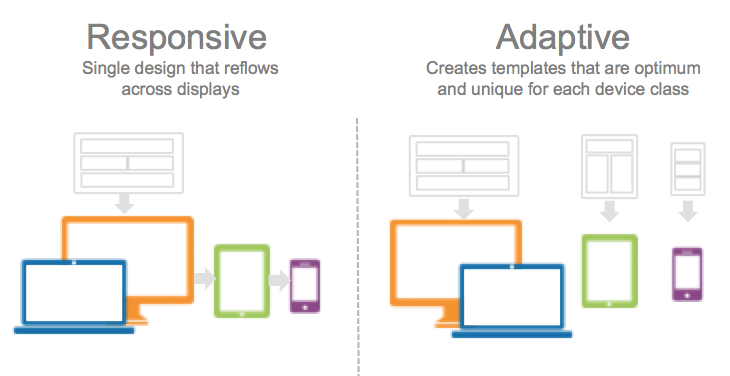
Responsive vs. Adaptive Web design
While Responsive Website Design works on fluid grids, media queries, and the @media rule, Adaptive web design (AED) utilizes many of the components of progressive enhancement (PE) as a way to define the set of design methods that focus on the user and not the browser. This means that while both the technologies offer an optimized mobile viewing experience, RWD relies on flexible and fluid grids, and AWD relies on predefined screen sizes. RWD wins hands down over AWD as it does not limit the design per the screen size.